Making of Six
Finding a new home for Sixty Six #
@ 00:05 May 31, 2020
I finally get to read “Redesign: Clearing A Path” by Frank Chimero. This post was the final note from his redesign journey.
Not only I love his design, I do also love what he writes. Reading these redesign notes got me think that it’s time to find a new home for Sixty Six.
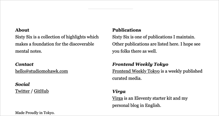
Virga was created for Frontend Weekly Tokyo. Not for Sixty Six. Moreover, Sixty Six is in an unique territory since it collects quotes.
That is why I’ll create a new theme “Six” for Sixty Six. (I like naming stuff. Well, “Six” is not that difficult to come up, but I like it anyway.)
And this is where my journey begins.
This is a story about creating a theme for Eleventy, and I’ll do it on open as Frank Chimero has done.
As always I don’t know how this story going to end, but I’ll document what happened to me along the way.
Notice the time stamp right after the header?
I think this journey will be long one, so I’m going to write this story open as well which means when I finished writing an “update”, I’ll make it public.
The time stamp indicates modification time.
Blank. Not broken #
@ 22:18 May 31, 2020
I’m not a designer. I had once called myself one but not anymore.
I haven’t done any development as a professional for long time either.
I definitely work around this area, but I’m not there.
Anyway.
Sixty Six has been distilled to blank state. Surprised to find out it is not broken. Surprised to see how simple Sixty Six is.
Which forces me to think about what Sixty Six is.
Here’s what I have come up so far.
“Sixty Six is a collection of highlights which makes a foundation for the discoverable mental notes.”
My english skill has been diminishing, but I still can tell this isn’t good one, but it is not broken.
What is the kernel of Sixty Six?
I’m not a designer. I may not be able to introduce myself as an engineer anymore, however I still love HTML and CSS. That has to account for something.
I’m nowhere close to answer the question.
I’ll start with HTML to find a way in.
My canvas #
@ 23:17 June 3, 2020
In “The Festival of Sunflower” (Translation is mine. It’s titled “ひまわりの祝祭” in Japanese) which is one of my favorite mystery book by Iori Fujiwara, main character had always built his canvas from a plywood in his high school.
He paint it white, torch it, make it flat and paint it white again. He does this several times to build his canvas.
I’m no artist. I’ve never done any oil painting, but I can empathize why he does this.
He said by doing this, he can produce interesting “matière”.
I’ve been thinking that browsers are the canvas.
The browser is not the canvas. HTML is.
The browser is the plywood.
I paint it white, torch it, make it flat and paint it white again. And I do this several times.
I think I now have interesting “matière”.
I now own the material I can build upon.
Start from the Caboose #
@ 23:15 June 9, 2020
I love tinkering with footer. When I design stuff, I tend to start working from footer.
Apparently so does Frank Chimero.
I bet there is a collection of footer design somewhere.
So that’s what I’ve done.
It’s been there for about one week.
I thought about using grid, but decided to go with The Switcher.
Every content are in it, but I think it’s too vanilla.
But It’s too early to talk about personality of Six yet.
Let’s work on other kind of footer: meta.
That’s where I put something like author, publish date etc.
It’s kind of like footer. I often even use <footer> for it.
Sixty Six has only one meta, yet again working from footer make sense for me.
I’ve prepended a symbol — to bylines which carry the message about Sixty Six.
I’ve gone back and forward if I should have other metadata other than authors.
The quote #
@ 21:18 June 15, 2020
Main contents for Sixty Six are quotes, and I have been working on it since I’ve started to do redesign.
I tend to quote the whole paragraph if it’s not too long; therefore, my contents tend to be short. It’s quite safe to say they are not long-form at all.
I need them to stand out, so the quote have given the largest font size.
Georgia is my choice for this redesign. I love working with typeface since I don’t get to do so in my day job. Japanese fonts are very heavy so for performance budget we’ve set, I cannot use custom fonts.
However, I still choose Georgia since this is how typically read in my Instapaper app which is where the most of the quotes come from.
Sixty Six is my bedrock for the discoverable memory. I don’t have any research to back this up, but I think it helps me to remember if the typeface for reading and recalling is same. I don’t have to question my self why I chose different typeface at least.
It’s been about one week since I’ve finished working on the quote and list of quotes.
It’s still very minimum, but I like minimum.
Adding spirit #
@ 21:39 June 18, 2020
One of the ways that I’ve found to add spirit to simple designs is through color. The color need not be showy, only rich and nuanced.
I am going to follow his advice. It seems very good one since I do like to work on color.
I want to add hint of my personality via color. I like green. I like red. And I like black and white. I was gonna pick one, but I use them all.
I’ve got a lot of help from Color Ninja and Sip for doing this.
And I think I’ve settled with current setting. I wouldn’t call it as a scheme since there no science behind my choice, but I think that’s what make this personal.
I also used a texture(it’s from Hero Patterns). It’s very subtle. fill-opacity='0.08' subtle.
Six is 1.0.0 #
@ 23:50 June 24, 2020
Sixty Six is stable, so Six is 1.0.0.
It’s been 24 days. I’ve been working on this whenever I have time, yet I feel I haven’t done much.
However, this journey has come to the end for now.
I’m sure I’m going to nurture this design time to time.
Very minimum but has a split. That’s how I see Six.
I’m happy with the result.
It’s been fun for sure.
Well, then until next journey.