Optimizing Images with Eleventy and GitHub Actions
To me, performance is a feature, and I simply like using fast websites more than slow websites, so naturally I’m going to build a site that I would want to use.
This statement from Jeff Atwood had gotten me into the #perfmatters initiative which was started by many Googlers. I still love faster web.
Often, JavaScript gets blame on this performance, and I do think it is the one of the biggest hurdle.
I don’t have any client side JavaScript working on Virga, so what’s next on the list for the change of the slowness?
Images.
I don’t have those too many on Virga, but I sometime do. And I haven’t done anything to images for performance optimization.
<img> element is a veteran of HTML. It’s been in HTML since I had started to write HTML, but it has gone through many changes.
It had introduced srcset attribute and image format like png, webp and the latest one avif. Moreover, <img> even has a new sibling <picture>.
What a journey it must’ve been.
And this is where my journey begins.
This is a story about implementing performance optimization for images using Eleventy and GitHub Actions.
The mighty <picture> element #
Some may think <div> has special power, and it is only element you’d use from HTML.
Those who resonated with that sentence, meet <picture>.
Now that webp and the more recently avif support on the way, it may not be performant enough using jpeg, png and gif anymore.
How would I use those newish image formats while keeping backward compatibility?
I’m pretty sure JavaScript can do it, but why would I need to have JavaScript to do it, when I can do it using HTML?
<picture>
  <!-- load avif if supported -->
  <source srcset="this-image-is.avif" type="image/avif">
  <!-- load webp if supported -->
  <source srcset="this-image-is.webp" type="image/webp">
  <!-- fallback for `source` and use attributes for presentation -->
  <img src="this-image-is.jpg" alt="You'd better not omit alt">
</picture>
When it compares with <div> or <span>, <picture> looks complicated, but above snippet isn’t a complete “picture”.
Well, <picture> doesn’t do much, actually. The true power resides with srcset and sizes.
The above snippet demonstrates the power of srcset, let’s look at what sizes has in its sleeve.
<img srcset="elva-fairy-480w.jpg 480w,
             elva-fairy-800w.jpg 800w"
     sizes="(max-width: 600px) 480px,
            800px"
     src="elva-fairy-800w.jpg"
     alt="Elva dressed as a fairy">
This snippet comes from “Responsive images” at MDN.
sizes looks complicated and even though MDN says it’s not that complicated, it is.
(max-width: 600px) part is called a media condition and “describes a possible state that the screen can be in. In this case, we are saying ‘when the viewport width is 600 pixels or less’.”, according to MDN.
480px which is right after a space is “The width of the slot the image will fill when the media condition is true.”
And I guess that 800px, one that never mentioned and right after a comma, is the width of the slot the image will fill when the media condition is FALSE.
sizes attribute determines which size of images should be used with in the viewport.
Let’s invert this, so it should make it a bit more understandable…
When we don’t want to use over-sized images for a small screen, use sizes to choose the appropriate image size.
So that means, I need to use sizes for every image formats.
Let’s combine both of snippets to unveil the true power.
<picture>
  <!-- load avif if supported -->
  <source srcset="elva-fairy-480w.avif 480w,
                  elva-fairy-800w.avif 800w"
          sizes="(max-width: 600px) 480px,
                 800px"
          type="image/avif">
  <!-- load webp if supported -->
  <source srcset="elva-fairy-480w.webp 480w,
                  elva-fairy-800w.webp 800w"
          sizes="(max-width: 600px) 480px,
                 800px"
          type="image/webp">
  <!-- fallback for `source` and use attributes for presentation -->
	<img srcset="elva-fairy-480w.jpg 480w,
	             elva-fairy-800w.jpg 800w"
	     sizes="(max-width: 600px) 480px,
	            800px"
	     src="elva-fairy-800w.jpg"
	     alt="Elva dressed as a fairy">
</picture>
This is powerful but surely a big chunk of codes.
Let’s not write this by hand.
I love markdown syntax for its simplicity.
Let’s turn this into the monstrously huge chunk of <picture>.
Using @11ty/eleventy-img with Eleventy Transforms #
@11ty/eleventy-img is a plugin for Eleventy which uses the sharp image processor and outputs multiple sizes, save multiple formats, cache remote images locally.
Examples at Eleventy Doc shows using it with Shortcodes, but I only use images in one layout and want to keep using Markdown syntax, I’ll use the plugin at Transforms.
@11ty/eleventy-img is a simple yet very powerful plugin.
After about an hour of trial and error, I’ve settled with this:
const metadata = await Image(imagePath, {
	widths: [1500, 750],
	formats: ['avif', 'webp', 'png'],
	urlPath: '/images/',
	outputDir: './11ty/images/generated',
});
metadata will yield:
{
  avif: [
    {
      format: 'avif',
      width: 750,
      height: 1168,
      filename: 'ce28e207-750.avif',
      outputPath: '11ty/images/generated/ce28e207-750.avif',
      url: '/images/ce28e207-750.avif',
      sourceType: 'image/avif',
      srcset: '/images/ce28e207-750.avif 750w',
      size: 23321
    }
  ],
  webp: [
    {
      format: 'webp',
      width: 750,
      height: 1168,
      filename: 'ce28e207-750.webp',
      outputPath: '11ty/images/generated/ce28e207-750.webp',
      url: '/images/ce28e207-750.webp',
      sourceType: 'image/webp',
      srcset: '/images/ce28e207-750.webp 750w',
      size: 37634
    }
  ],
  png: [
    {
      format: 'png',
      width: 750,
      height: 1168,
      filename: 'ce28e207-750.png',
      outputPath: '11ty/images/generated/ce28e207-750.png',
      url: '/images/ce28e207-750.png',
      sourceType: 'image/png',
      srcset: '/images/ce28e207-750.png 750w',
      size: 175924
    }
  ]
}
By looking at this output from the plugin, I can see what I’d need to construct <picture> and its siblings.
Since I’ve already had an Eleventy Transform for enhancing an article, I’m going to use it.
Transforms can modify a template’s output. I’d like to think of it as a post-processing tool in Eleventy.
So for an article, a markdown file is used to build an HTML file, Transforms will take that output(the HTML file) and modify it.
By using this, I can “transform” this:
into
<picture>
    <source type="image/avif" srcset="/images/ddf2e4b9-558.avif 558w" sizes="(max-width: 768px) 100vw, 768px">
    <source type="image/webp" srcset="/images/ddf2e4b9-558.webp 558w" sizes="(max-width: 768px) 100vw, 768px">
    <source type="image/png" srcset="/images/ddf2e4b9-558.png 558w" sizes="(max-width: 768px) 100vw, 768px">
    <img src="/images/ddf2e4b9-558.png" alt="Site flow for Virga" title="This is a site flow for Varga" loading="lazy" decoding="async" width="558" height="678">
</picture>
If I needed more granular control how the final HTML turns out to be, I should use Shortcodes.
Now that I’m satisfied with my initial attempt for this Transform, I’ll move it to MOLLE for finalizing it.
Automatic optimization for images by GitHub Action #
I can always compress images at local using trusty ImageAlpha and ImageOptim. Or Squoosh CLI which can “optimize” webp.
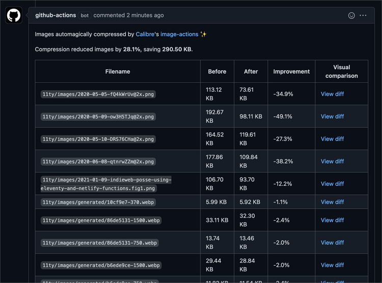
If I have an image on every article, then I would remember doing the optimization on local, but I don’t. So let’s automate it using calibreapp/image-actions.
I have previously worked with GitHub Action. Let’s say I did not have a good time back then.
Long story short, it is pretty difficult to test the action. For example, when I trigger GitHub Action by a pull request or push to the repository, I have to do it.
My last attempt was scheduling deploy, so it was particularly difficult.
And there is always smart folk on Internet, nektos/act can “[r]un your GitHub Actions locally 🚀”.
This tool seems like a godsend for me.
After installing Act via Homebrew, I run act -g which draws workflows:
act -g
╭──────────────────────────╮
│ calibreapp/image-actions                  │
╰──────────────────────────╯
Oh, for the workflow, I did copy and paste from README.
So I think it looks good so far, then I run act -n which is dry run.
*DRYRUN* [Compress images/calibreapp/image-actions] 🚀  Start image=node:12.6-buster-slim
*DRYRUN* [Compress images/calibreapp/image-actions]   🐳  docker run image=node:12.6-buster-slim entrypoint=["/usr/bin/tail" "-f" "/dev/null"] cmd=[]
*DRYRUN* [Compress images/calibreapp/image-actions] ⭐  Run Checkout Branch
*DRYRUN* [Compress images/calibreapp/image-actions]   ✅  Success - Checkout Branch
*DRYRUN* [Compress images/calibreapp/image-actions] ⭐  Run Compress Images
*DRYRUN* [Compress images/calibreapp/image-actions]   ☁  git clone 'https://github.com/calibreapp/image-actions' # ref=main
*DRYRUN* [Compress images/calibreapp/image-actions]   🐳  docker run image=ghcr.io/calibreapp/image-actions/image-actions:main entrypoint=[] cmd=[]
*DRYRUN* [Compress images/calibreapp/image-actions]   ✅  Success - Compress Images
*DRYRUN* [Compress images/calibreapp/image-actions] ⭐  Run Create Pull Request
*DRYRUN* [Compress images/calibreapp/image-actions]   ☁  git clone 'https://github.com/peter-evans/create-pull-request' # ref=v3
*DRYRUN* [Compress images/calibreapp/image-actions]   ✅  Success - Create Pull Request
If I run act, it defaults to do push event, so I guess this is dry-running push.
act pull_request -n would mean run pull_request in dry-run mode.
I’ve got nothing. act pull_request gave me nothing as well.
# Only run on main repo on and PRs that match the main repo.
if: |
  github.repository == 'frontendweekly/virga' &&
  (github.event_name != 'pull_request' ||
   github.event.pull_request.head.repo.full_name == github.repository)
This was the culprit, more specifically github.event.pull_request.head.repo.full_name == github.repository line was the cause.
Remove entire if, then did act pull_request -n. It looks good.
Act is intended to work as a local task runner so, if I run it without -n it should actually compress images, but since I want to see, what actually happens when real push or pull_request have triggered.
Well, then until next journey.